OK UserTesting.com might not be perfect but it's pretty darned awesome. The rub with this site is that you can very quickly turn around a test with both a video and a written report. The company pays a pool of participants $10 per test & your out-of-pocket expenses are only $30 per 15 minute test.
Value
This is an incredible value considering in-house testing 5 users for 15 minutes will almost certainly cost no less than $300 (assuming a jr. usability professional spends one full day @ $30/hour & users are compensat $10). UserTesting.com cuts that price in half.
Return on Investment
Assuming you've got a team that can rapidly iterate, this is great for a product that's getting tuned or for a product that needs initial investigation. You have to do your own calculations on whether or not this is cost-effective
Doing this testing for each round of iterations would go miles further (and be a lot cheaper) than gathering several coworkers in a room to attempt to accomplish UI design. It's often an uphill battle trying to speak for what users will understand & relate to. But when you have evidence, there can be no dispute. For this reason alone, this has the potential to have a high ROI.
What is it good for?
Usertesting.com has some limits which means it can't yet completely replace in-house testing. Namely, software products it would not make sense for audiences to which you already have immediate access and a low-fi prototype might cause confusion so I'm not sure if that's possible.
Also, I'm not yet sure how long you have access to each video. Anyway, here are the huge plusses:
* Software as a service model means no downloads or storage of huge video files.
* Very quick turnaround--five 15 minute user tests will likely finish within 24 hours.
For live-site testing, this is excellent is an incredibly useful tool to add to the toolbox & look at the buzz they're getting!

Sunday, September 6, 2009

Thursday, August 20, 2009
Why spelling matters
warning: this post is a thinly veiled Rail against bad spelling & customer service
I'm a bad speller. Horrible would be the proper word. When spell-check or the nearest English major can't help me out, I just do my best & rely on hope. Luckily, I'm not in charge of storefront signs.
On my way to work every day I pass GreenCitizen. They believe in making the world a better place by recycling electronics. But they don't believe in grammar check.
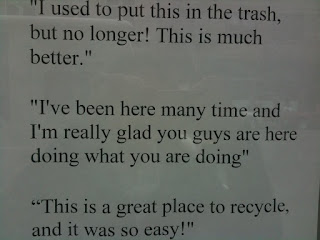 "I've been here many time?" OK I get it, this is from a customer & maybe GCitizen doesn't think refelcts badly on them.
While I can't spell, it doesn't mean I don't appreciate it so I decided to take up the issue with the company.
I started subtley, by putting a stickie on their window with an arrow pointing to the misspelling, which read "(sic.)" to indicate the misspelling was caught. The next day, my stickie was gone.
About a month later. I stopped an employee on his way in & told him how this sign's error bothered me.
"Why do you care if there's a misspelling?"
"Because I pass it every day & it doesn't make you look as good as you are"
He assured me he'd take care of it, but it's still there now, a full month later. :(
Now this issue has crossed into the realm customer service. This is no longer about company image, this is about following through on a commitment.
The panda says no blog lists more examples like above. The panda reference is from the Book Eats, Shoots & Leaves which is a surprisingly delightful read for those of us who are weaker in writing mechanics.
PS: Blogger's spell-check is pretty wonderful
I'm a bad speller. Horrible would be the proper word. When spell-check or the nearest English major can't help me out, I just do my best & rely on hope. Luckily, I'm not in charge of storefront signs.

On my way to work every day I pass GreenCitizen. They believe in making the world a better place by recycling electronics. But they don't believe in grammar check.
 "I've been here many time?" OK I get it, this is from a customer & maybe GCitizen doesn't think refelcts badly on them.
While I can't spell, it doesn't mean I don't appreciate it so I decided to take up the issue with the company.
I started subtley, by putting a stickie on their window with an arrow pointing to the misspelling, which read "(sic.)" to indicate the misspelling was caught. The next day, my stickie was gone.
About a month later. I stopped an employee on his way in & told him how this sign's error bothered me.
"Why do you care if there's a misspelling?"
"Because I pass it every day & it doesn't make you look as good as you are"
He assured me he'd take care of it, but it's still there now, a full month later. :(
Now this issue has crossed into the realm customer service. This is no longer about company image, this is about following through on a commitment.
The panda says no blog lists more examples like above. The panda reference is from the Book Eats, Shoots & Leaves which is a surprisingly delightful read for those of us who are weaker in writing mechanics.
PS: Blogger's spell-check is pretty wonderful
Thursday, August 13, 2009
Mods to a parking meter

Parts of the city of Oakland, now use a kiosk system for parking yet some of the meters remain. This causes confusion, to be sure.
Check out the mods to this meter meant to indicate that the parker should not use the meter:
- Removed meter stick
- Gutted coin slot

It would be much nicer to see a sticker pointing the parker to the kiosk since this design mod seems to say: "Don't pay" when the desired message is really: "Don't pay here. Pay over there!".
Wednesday, August 5, 2009
Old School UI
Saw this bit of Old School UI in a dressing room the other day and all I could think was "wow...you care!" What a great way to allow customers to keep & stay in contact with the dressing room attendant and in art deco style no less.
So with that introduction I present . . . a Button to press.

Monday, August 3, 2009
A random meeting with IXDA SF
Walking home from work last month, I wanted do something different, you know? My default activity is browsing stores. I don't mind heading into a store & looking at stuff for the mental stimuli.
On my way home from work I took an alternate route to do just that.
I encourage you to branch out & get involved in something. Political organizations, a book club, volunteer work, alumni groups, or if you're a UX designer in the Bay area, there's always IXDA-SF.
On my way home from work I took an alternate route to do just that.
I did a double take as I was passing a place called House of Shields. A sign in the window read "Interaction Design Association social upstairs". I stopped in, put on a name tag & started chatting with folks. Name tags were color coded in three styles; One to indicate 'looking for work', one to indicate 'hiring', & a third to indicate 'just mingling'.
I didn't stay long but I left feeling refreshed. There's a lot of smart & funny people in this field & it was fun meeting some of them.
I encourage you to branch out & get involved in something. Political organizations, a book club, volunteer work, alumni groups, or if you're a UX designer in the Bay area, there's always IXDA-SF.
Sunday, July 26, 2009
User Experience: my own definition
My definition of the role of user experience design is something like this:
I say nothing about the tools, deliverables, or methods but I hope I provide a new spin on something I've, in the past, struggled to describe.
What UX designers do: Products should create a smooth experience for customers. Not a bumpy road, not a mine field. An awesome user experience designer considers all touch points to optimize product engagement and delight--something I call "flow".
Scope: Proper UX involves visibility across departments and ties into the development process, back-end architecture, customer service, & advertising experience. This is the one person in your company who keeps her/his eyes focused squarely on the enduser.
In other words, pretty images & icons are nice. But being able to checkout quickly is totally awesome. Get it?
Success Measures: Once users exit the flow, user experience designers want users to remain enthusiastic, recommending, & sharing the spoils of the product, with others.
I say nothing about the tools, deliverables, or methods but I hope I provide a new spin on something I've, in the past, struggled to describe.
Tuesday, July 21, 2009
Story of two Red Carpets
Which red carpet would you rather step out on?
Esteemed US visitor Red Carpet
 Above you'll see a 2006 state department photo of the Japanese Prime Minister arriving near DC. This is Wikipedia's demonstrative photo for "red carpet". As you can see there's a sense of class and royal treatment.
The Avis Red Carpet
I didn't find any Avis messaging that might explain what they mean when they say red carpet-- neither through a web search nor through their web site.
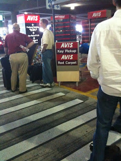
In the dystopian novel 1984, the aim of Newspeak ultimately is to destroy meaning. Nothing means anything when you see signs like "freedom is slavery". The destruction of language is being used in packaging, marketing, and politics. At Avis a few weeks ago, several of us in line certainly didn't feel we got the red carpet experience waiting in 90 degree weather. This is only a bit of the line (pictured above) faced with a sign: "AVIS Key Pickup AVIS Red Carpet"
What does red carpet mean when a company or person uses that language to describe something that's the opposite of the word's dictionary definition.
But there's a bright side: We live in a country where we can retort without fear via sites like Yelp Glass Door & the Politico Truth-o-Meter
Monday, June 29, 2009
Photoshop in real life
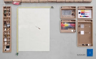 This gets me nostalgic about when I first learned Photoshop in the computer labs at the U of Illinois.
Thursday, June 25, 2009
Unintentional design
 Intended use: Use face down & push prongs securely into a drain to prevent hair and other debris from entering and clogging the drain.
Unintended use: Leave prong side up to poke holes into the bottom of a foot
Mods to a parking machine

Modification to parking payment system at Moscone Center in San Francisco
- One orange piece of paper labeled: "INSERT"
- One orange piece of paper labeled: "Please insert ticket STRIPE to the left"
- One example ticket with the strip facing left
- Contactless rard reader attached
Subscribe to:
Posts (Atom)