Thursday, March 3, 2011

Keep your fonts safe from the web

I feel like sharing two practical links for those of you hemming and hawing about what fonts to use on the web. If you're like me you hate making these choices. If you're really like me and you go unchecked, you'd use every font you possibly could on the same web page. Here are two sites to keep you in check:

Kathy Marks's summary is great


 I also like this MIT students summary and it's great to see the font examples. This is by Jacob Morzinski.


I wish all fonts will be safe for this dangerous web. I may have to start blogging in wingdigs. Or maybe just about them.

Monday, February 14, 2011

No Joke: A soda ui

I got a slice and soda near Stanford's campus last week and saw this. This soda machine has two interactions:
  • Select a drink using the touchscreen.
  • Push the button labeled "PUSH"


As you can see below, there are actually five variants to the original choice of a Sprite.  To go back, there's a little left arrow button.

Monday, February 7, 2011

Nerd love: Science and Tech Valentines

Leave it to Etsy to provide a venue for an artist to something this awesome: Science Valentines.
"Tired of handing out valentines with commercial characters printed on flimsy cardboard? Want some classy, nerdy valentines to give to your friends (and sweethearts) that aren't just for kids?" - Stephoodle

Tuesday, February 1, 2011

Cabin Fever: A study of US Airways user interface

International flights don't excite me. Oftentimes, I do not sleep, so to make the time pass I watch movie after movie, arriving at my destination bleary-eyed and full of anticipation that upon seeing my red suitcase on the baggage claim will result in a dramatic swelling of music.

What delights me about these flights, though, is checking out their user interface. It's a chance to study how an airline does a multimedia player.

The home screen


The Category page for TV
After you choose a category you can play or view a preview


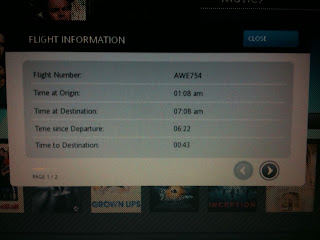
Checkers love this  page,  since it has estimated time of arrival! They offer another page (which somehow I didn't capture) with a map with your departure and arrival countries and a large plane graphic in the current position.

Overall, could the User experience be better? Oh, yes, but it's pretty darned good.

Monday, January 31, 2011

Reverse wireframe any website: wirify

If you've ever wanted to see a website in it's raw wireframe form, the folks at Volkside have created a tool that does just that!

Here's a Slate Article page and the Wirify version:


What's extra cool is you can simply add the bookmarklet to your bookmarks to do this instantly.

The downsides are few:
  • It would be nice to have the option to see Greeked or even the original copy. 
  • Since some sites are huge on graphics, some of the translation gets a bit lost.
Overall great job, Volkside. Wish I thought of, designed, and implemented it, myself!

Wednesday, January 26, 2011

Google, I really love your ... style

Check out the PS on this adsense letter. 

This has got to be one of the coolest PS's ever (found on Reddit).

Tuesday, January 18, 2011

Things Real People Don't Say about Advertising

Here's a funny post from Things Real People Don't Say about Advertising. It's actually not nearly the most funny example of the hilarious language web folks use.

Friday, January 14, 2011

End-User!

It's really rare for me to hear the term "end-user" anymore.

But when I do I giggle.

It sounds like a call to arms, and I can picture angry folks getting together to put an end to this user experience. If you can't picture this, I've provided the image to the left to help.