Wednesday, August 17, 2011

What's the most lame product you've ever seen?

Wha?
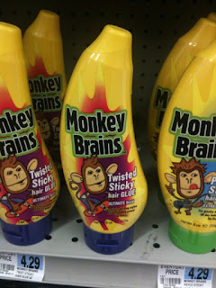
How on earth do products like this make it out the door? When you think about how many stages there are in a product life cycle, market research, sketching, prototyping, manufacturing it boggles my mind how this one got past the first stage. Here are just some of the things that make me want to find the person responsible for this and shake him/her:
  • The over $4 price point. The banana packaging makes me think kids might find this desirable, but this is way too expensive to delight a sane parent. 
  • This isn't bubble bath--it's hair product. So this is in the same category as CREW, Bed Head, Dove, and other brands that scream "you respect yourself and we respect you. Let's make you look good." This brand screams "We are very silly and gross! Massage this on your hair."
  • I'm all for Zagging when others Zig however, it needs to be done with your market in mind. Who on earth is this for? Is it human?
  • The monkey theme is cute but monkey brains aren't cute.

What's the most lame product you've ever seen?

Friday, August 5, 2011

Hip Happenings


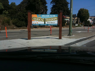
I adore architecture and sculpture. Somehow, I generally don't love it when cities try to sell their neighborhoods with poorly-designed sinage or art. Below find an apt description of the Temescal district: Cool shops, Global Eats, and Hip Happenings. Yes, all of this is true, but somehow saying it . . . like this . . . I guess what I'd rather see is a font & design that works to capture the image of a world-class neighborhood.

Berkeley shines a spotlight on the border it shares with Oakland. This  split "Here" on the Berkeley side and "There" on the Oakland side is called playful by some, irksome by others.  I do like the font and sheer size of the sculpture. Can't say I like the message, though.

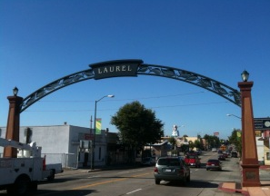
Laurel's archways in Oakland are loud and proud. Providing two archways at the start and end of the Laurel's main street, this is expressive, easy to read, easy on the eyes, and seems to be happy to see you.

Wednesday, August 3, 2011

Extra Packaging

While at Target (maybe my favorite store) I was checking out the kettle bells when I passed these weights. Weights are designed to be held. Yet here are some 3 pound weights with a strap. Hm.

Monday, August 1, 2011

Our site launched!

Last year, after over a decade as a full-time interaction designer, I started working as a contractor. Along the way I started collaborating with a former Mills College classmate, Raye Oldes. We worked well together and we decided we were no longer contractors, we were acting and working more like a small company. Our clients thought it was a good idea too! Neat, huh?

It's with great pleasure that I introduce TUX Studio. What's TUX mean? It stands for our obsession:  The User eXperience. As we wireframe, storyboard, usability test our hearts out, we never forget why we're here: To provide users an excellent experience while making our clients feel pretty awesome too.

Friday, July 22, 2011

End on a good note!

Regarded as one of the most influential living psychologists, Daniel Kahneman won the Nobel Prize for his pioneering work in behavioral economics. His lecture "The riddle of experience vs. memory", teaches us two important lessons:
  1. Our perceptions . . .well, don't trust them all the time. 
  2. The final parts of an experience are disproportionately  heavily weighted in our minds. They leave a more lasting influence. So if you are crafting an experience, end on a strong note.

Saturday, July 16, 2011

Do you sketchboard?

One of the more fun activities in user experience design is working with a group to sketch and plan. Nothing is more enjoyable than watching a group construct an early draft of a customer experience on paper, thinking through the process and coming up with something that can be put into a more formal document.


Here's Adaptive Path's How to video on creating sketchboards:

Sunday, July 10, 2011

A scene from the office

Here are my favorite markers ever. Sharpies. The color variety and as they say in the beauty world "payoff" is awesome. 
Here are the markers in action. I created these using the pages of a book.

Friday, July 8, 2011

The story of two logos: Fliptop vs Versartis

Here are two logos I found while researching companies on the ever useful CrunchBase:
When I see a logo like FlipTop I think:
  • If this is how much time and effort they put into their brand, I bet they are awesome at what they do too.
  • They are modern, fun and competent.
  • I'd be excited to meet someone from this company, not to mention work with them. They get it.
 
When I see a logo like Versartis I think:
  • This is most definitely a B2B company that is comfortable with minimal branding effort since their products do the heavy lifting.
  • Design is not a priority here.
  • If I work with them, it runs the risk of rolling a boulder uphill. As a UX designer I could have an impact if the product or the platform is new. I'd need to investigate how the team works so I can tell what kind of change the company is and is not open to. This will drastically effect the success of the project. Excellent UX designers want the customer/user to rule. This is much more difficult when the legacy dictates.
  • STILL, their products must be demo'ed, trialed, or sold. A better user experience is something that will help deepen customer trust.

Tuesday, July 5, 2011

Control+P+Print!

A friend of mine introduced me to Eddie Izzard and if you've never heard of him I'm excited for you to watch this video. Rather than operate from a script (he credits his dyslexia as the reason scripts don't work for him), he free associates comedy.

This clip was part of an encore in which Eddie Izzard describes his love hate relationship with computers:


Oh and if you wonder about his adorable cross-dressing, watch this: