

Monday, November 30, 2009
Monday, November 23, 2009
This invention is long overdue

Check out how artist Bruno Taylor modified several bus stops in London. I love this idea :)
Friday, November 20, 2009
Design Heuristics by Wicken, Gordon, & Liu
Thanks to one of my classmates at the University of Illinois, Michael Berner, I still have & use the "13 Principles of Display Design" the seminal textbook An Introduction to Human Factors Engineering from a class of the same name we took together in 1997. The author, also our instructor, Christopher Wickens is an academic visionary in the field of Human Factors. After U of I, Christopher Wickens joined the University of Colorado before joining Alion Micro Analysis & Design, a consulting services and software products company. Please find the book citation at the bottom of this entry. OK, on to the heuristics. My personal favorites are #3, #9, and #10.
Perceptual Principles
1) avoid absolute judgment limits: do not require the operator to judge the level of a represented variable on the basis of a single sensory variable (e.g., color, size, loudness) which contains more than five to seven possible levels (for some dimensions an even smaller number of levels is preferable; e.g., saturation)
2) take into account top-down processing: if a signal is presented that is contrary to expectations, more physical evidence of that signal must be presented to guarantee that it will be processed
3) make use of redundancy gain: same message in alternative physical forms (not simply repetition; e.g., traffic lights: position and hue are redundant); the factors that might degrade one form (e.g., noise degrading auditory message), will not degrade the other (e.g., printed text)
4) ensure discrimination (similarity causes confusion): delete unnecessary similar features and highlight dissimilar ones in order to create distinctiveness (what causes two signals to be similar is the ratio of similar features to dissimilar ones)
Mental Model Principles
5) principle of pictorial realism: a display should look like (i.e., be a picture of) the variable that it represents (e.g., temperature can be high or low, therefore a temperature display should be oriented vertically); if a display contains multiple elements, these can be configured in a manner that looks like how they are configured in the environment that is represented (or the operator's conceptualization of that environment) [principle of configural displays]
6) principle of the moving part: the moving element(s) of any display of dynamic info should move in a spatial pattern and direction that is compatible with the user's mental model of how the represented element moves (e.g., increasing altitude, upwards movements of the moving element on an altimeter; BUT: limited display space in the cockpit)
sometimes these principles are conflicting: for example, display of an aircraft's banking position relative to the horizon; from the pilot's perspective, the horizon is moving; from a pictorial realism perspective, the airplane is moving; SOLUTION: so-called frequency-separated displays, combine aspects of a fixed-pointer moving-scale display and a fixed-scale moving-pointer display)
7) ecological interface design: adherence to the ecology of the displayed world (see above); map of system, allow access at/to different levels of abstraction; support skill-, rule-, and knowledge-based behavior; semantic mapping & direct manipulation
Principles Based on Attention
8) minimizing information access cost: minimize cost in time/effort of "moving" selective attention from one display location to another by keeping frequently accessed information sources close together so that the cost of "traveling" between them is small
9) proximity compatibility principle: when two or more sources of info are related to the same task and must be mentally integrated to complete the task (i.e., they have close "mental proximity") provide them with close "display proximity" by displaying them close together so that their information access costs will be low (in extreme: integrated displays; maybe also: emergent features). However, too much close display proximity is not always good, particularly if one of the elements must be the subject of focused attention
10) principle of multiple resources: sometimes, processing a lot of info can be facilitated by dividing that info across resources (presenting visual and auditory info concurrently, rather than presenting all info in visual format or all information in auditory format) -- important: input modes, response devices, and tasks should be combined such that they are as dissimilar in terms of processing stages, input modalities, and processing codes (e.g., voice dialing [verbal/vocal code/output] a phone number while driving [visual/manual input/code/output] is easier than entering the phone number by key presses)
Memory Principles (consider short-term memory as well as long-term memory limitations)
11) principle of predictive aiding: prediction is a difficult cognitive task (high load on STM) humans are not particularly good at, esp. when our mental resources are consumed with other tasks; proactive behavior is usually more effective than reactive behavior; displays that can explicitly predict what will (or is likely to) happen will generally be quite effective in human performance
12) principle of knowledge in the world (versus knowledge in the head; Don Norman's distinction): placing explicit visible reminders or statements of what is to be done (or how to do something or what something is) at the time and place that will trigger the appropriate action (e.g., pilot's checklist; computer menu listing all available commands); BUT: can lead to clutter; good design must find balance
13) principle of consistency: will lead to positive transfer between different displays (support processing of new displays); e.g., red always means the same thing, consistent organization of display panels.
"An introduction to human factors engineering" by Wickens, C. D., Gordon, S. E., & Liu, Y. (1998). New York, NY: Longman Amazon.com's product page
Thursday, November 19, 2009

Tuesday, November 17, 2009
In Praise of Humility - quotes from Joshua Blankenship's blog
Unsolicited designs, if they’re going to be done at all, should be communicated with class, humility, & a ton of research.
Joshua Blankenship in his blog So Serious in an entry titled Creating Controversy for its own Sake (and How Humility is a Rare Bird Indeed on the Web These Days)
The web will still be full of arrogant, uninformed, polarizing, self-promoting, controversy-creating content that has ramifications no one wants to own up to...still be lacking in common courtesy, humility, and the admittance that most of us don’t know best
Saturday, November 14, 2009
Summaries, executive & not
Summaries are critical to anchoring a reader down when they are faced with complex, detailed, and large volumes of writing. I believe if you call it an Executive Summary you won't just save the reader time, you'll make the audience feel important. Just make sure your summary lives up to it's name.
Friday, November 13, 2009
Quick Thought: What's in a name? Centuries of comprehension
Writing good site/application copy isn't easy. Naming features and companies is even harder.
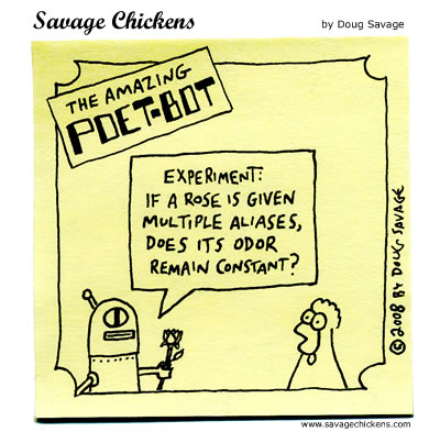
A rose will still smell like a rose if it is called a rose but if today if we renamed roses to something like, say, snaggles, it would be very, very strange.
Shakespeare assumed we were starting from scratch--we are not. Language has been around too long to be forgettable. Language carries with it centuries of baggage. Opting for clarity above fun, catchy, colorful, or alternative language might seem boring, but muddling a message is rarely good . Since this is UX though, there are always exceptions. Like this Bouys & Gulls bathroom sinage. So cute!

Monday, November 9, 2009
The one UX person you should follow on twitter
 Jane Pyle - UX designer at Genentech. iPhone app design.Branding.Emotional design.Usability
I read a lot of UX blogs & tweets (just save a #ux search if you need some mojo, links, or articles) and Jane consistently delivers the coolest UX tweets. They're fresh, entertaining, & thought-provoking.
Recent Tweet Recap from Jane Pyle
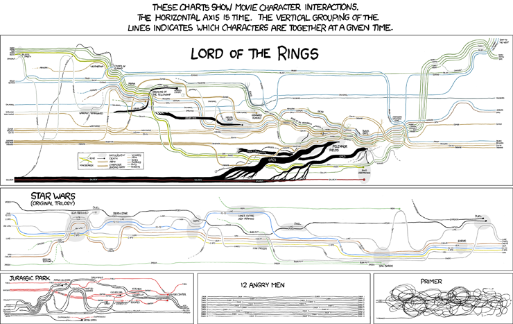
- Movie information visualizations
- A hilarious Electronic System for Travel Authorization form at IQBlog Oh, if only catching criminals were so easy.

- LinkedIn is in the midst of a Redesign!

- Cutting non-data out of a map, literally

- Long overdue: wireframe magnets
Sunday, November 8, 2009
An ode to ET
Tufte shares Orwell's impatience with doublethink and humbuggery, his insight that bad thinking and bad expression travel in a pair, and . . . that they are usually deployed in the service of some brand of propaganda.SCOTT ROSENBERG "The Data Artist" on Salon.com
Lies the parking meter told me
OK, I get it. I can park here for only 30 minutes. Good to know...
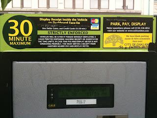
 You're telling me it costs $2 an hour. Ummm.
Don't you mean $1 for 30 minutes since that's the cap? Yeah, you probably do.

 You're telling me it costs $2 an hour. Ummm.
Don't you mean $1 for 30 minutes since that's the cap? Yeah, you probably do.
Saturday, November 7, 2009

Thursday, November 5, 2009
Dear AT&T: you're creeping me out
When I get a text after 10pm on a Monday it better be someone I love very much. My eyebrows furrowed as I received this a month into my service.
>:P

>:P

Subscribe to:
Posts (Atom)