Check out two adorable patterns I made using Repper Pro:
The above pattern is constructed from a photo of a building and blue sky in Chicago. Sadly I don't know this gorgeous building's name. Below, find the original photo:
This cute-as-a-button quilt-like pattern is also from a photo. Can you guess the material you see?
Using Repper Pro is a way to pay tribute to patterns. In fact the folder in which I put all my Repper Pro cuteness is called "Pattern Love". Go to their site to play with their free online version now.
I ran across this adorable idea by Innovative Thunder aimed at bloggers or content creators. If you'd like to offer readers/visitors a free download, do so in exchange for a tweet!
The idea is simple--rather than including the file as a plain Jane link, your reader will hit this button: and they'll be able to download your ebook/newsletter/template file in exchange for tweeting about your free download. Once you select "Pay with a Tweet" you'll get a window that pre-formats a tweet (something like downloaded xyz from link) then you can "Post Tweet and Download Now". What an innovative marketing mix!
UX requires empathy with the user. You need to be able to feel the users delight and disappointment as if it were your own. There are many modes of listening and I found this random but awesome article breaking down the types of Listening:
passive/not listening - noise in background - ignoring
pretend listening - also called 'responsive listening' - using stock nods and smiles and uhum, yes, of course, etc.
biased/projective listening - 'selective listening' and intentionally disregarding/dismissing the other person's views
misunderstood listening - unconsciously overlaying your own interpretations and making things fit when they don't
attentive listening - personally-driven fact gathering and analysis often with manipulation of the other person
active listening - understanding feelings and gathering facts for largely selfish purposes
empathic listening - understanding and checking facts and feelings, usually to listener's personal agenda
facilitative listening - listening, understanding fully, and helping, with the other person's needs uppermost
User testing and user interviews often fall somewhere between 6 and 7. An ideal customer service experience with IT should be 8.
I've been listening to Andy Rooney on 60 minutes and I admire that man. He's been in journalism so long that he's got the kind of perspective one has to respect. So it's with my hat off that I imitate his inflection in this post:
Why is it every I go to a website I have to pick "show 200 per page" or "Show all"?
It seems like even if I've been to that site 1,000 times I have to do that click 1,000 times.
I have what's called DSL in fact, my husband and I have been discussing going the next step up and getting cable so that we can both watch videos at the same time without intolerable lagging. Even with our midgrade DSL, these list pages, with all of their photos and information load fast. But that doesn't matter since I still have to click the option to see more per page. Then I have to scroll past he ones I've already seen the fist time.
Why don't these sites remember that my computer connection can handle more than 25 rows? Why do they make me click every single time I visit their site?
I guess I'm at the mercy of these sites. I'm not going to stop visiting them because of this annoyance. But I just hope just one site changes their ways to save me a click. I'd appreciate it.
If you didn't get a chance to go to any fancy-schmancy conferences this year, read UX Week 2009 in a Nutshell
In October of 2009 I asked What companies have a VP of UX? I was surprised. Since then there's been a lot of moving and shaking in the UX world and a lot more VPs and Directors. I'll be revisiting this topic soon.
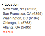
I've been following this trend on Indeed.com, a job search aggregation site -- First I search "user experience design" and look at where the positions are (this is a mix of consulting/full time and part time). For a while now, there have been tons of openings NYC! As you can see from the screenshot above, NYC has more than double the UX openings. San Francisco's number is on par with Chicago, DC, and yes, Atlanta, Georgia.
For a while now I've been noticing tons of UX's form NYC & they have a slick style! NYC seems more Hulu while Silicon Valley is more Youtube. Check out Squarespace and compare it to Weebly.
Could the people responsible for this so something totally awesome?
I've been fascinated by Microsoft's new game console, Kinect and apparently it's awesome to use! Fine don't believe me. Watch the video below to se revolutionary applications of a hardware-less interface.
To be loved currently, but in the future, to simply survive, technology must be nice, cool, useful, and work perfectly with us humans, weird, sloppy, moody, confused as we are. Technology is here for us and should adapt to us. Technology should meet our needs.
So I'm floored to see ad campaigns like this Droid Phone commercial, which propose the opposite: that humans are the ones who need to adapt to technology by being more like it. I thought the phone was supposed to be the droid, not the customer.
Do you dream of being like a computer? Do you want to type so fast it makes you look like you're a robot? Tired of those clumsy flesh hands & arms? Buy a Droid, free your inner typist!
UPS ground is default though takes twice as long for us on the West Coast, USPS priority is Faster than Fast! am I missing anything? Does this confuse you too?
I find industrial interface design captivating because they work with so many constraints. Look at what this designer was faced with when applying labels to this thermostat: four teeny-tiny buttons.
I admire how the designer used icons and created boxes around the small buttons. The icons reinforce the meaning and the boxes increase the perceived size of each button. Well done, SensorStat! An excellent example of working within physical limits.
I cannot remember what I may have typed several months ago. I may have been in an ice cream phase back then but no, that doesn't work either. Blueberry pie has always had a special place in my heart. As well as caramel corn. But none of that helps me now.
I get it. Banks want to seem secure. Please though, ask questions who's answers do not change. Election cycles effect my favorite president. My mood effects what food I like.
I'm not going to tell this to the person on the other line of their 1800 number of course. This feedback doesn't belong anywhere but on a UX blog.
Why doesn't every company have an elevator pitch? Probably because not every company has a business plan, real market, or strategy. Sad, but true.
An elevator pitch should be done or at least drafted in the ideation phase for startups. It's ok to fumble at it but once you are selling (to VCs, to customers ect) you have to have this down.
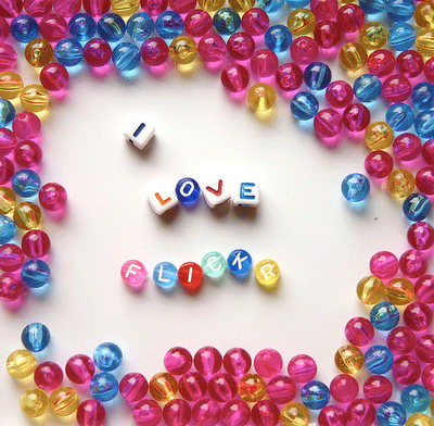
To begin building my brand I wondered: how could I get a high resolution quality photo of some random item.
First I googled and sifted through the mostly OK images. The earth-shattering, beautiful options were all stock photos. ranging in price from $100-$1,000.
Ew.
Then I turned to Stock Photography's night mare: Flikr. Aside from way more choices and better pictures, the people who took them are NICE and all too happy to let you use their photo in your website (I've asked twice three times now....not a large sample size but I don't care!)
If you've always wanted to know how Rutgers does data visualization, there's finally a place to look. Back in the 90's some instructors had handouts which were essentially course notes. Nowadays, some kind professors are going the extra mile, giving kids audio & video. Instructor Anselm Spoerri, you are awesome.
Wane's World did one of the best parodies of something happening all of the time on reality TV: cross-marketing.
Some of my favorite shows involve segments where they pitch products with this same deadpan approach and minus the humor. But I have to think the TV contestants are subconsciously remembering this scene to justify hocking wares they don't even like.
Benjamin: Wayne! Listen, we need to have a talk about Vanderhoff. The fact is he's the sponsor and you signed a contract guaranteeing him certain concessions, one of them being a spot on the show. Wayne Campbell: [holding a Pizza Hut box] Well that's where I see things just a little differently. Contract or no, I will not bow to any sponsor. Benjamin: I'm sorry you feel that way, but basically it's the nature of the beast. Wayne Campbell: [holding a bag of Doritos] Maybe I'm wrong on this one, but for me, the beast doesn't include selling out. Garth, you know what I'm talking about, right? Garth Algar: [wearing Reebok wardrobe] It's like people only do these things because they can get paid. And that's just really sad. Wayne Campbell: I can't talk about it anymore; it's giving me a headache. Garth Algar: Here, take two of these! [Dumps two Nuprin pills into Wayne's hand] Wayne Campbell: Ah, Nuprin. Little. Yellow. Different. Benjamin: Look, you can stay here in the big leagues and play by the rules, or you can go back to the farm club in Aurora. It's your choice. Wayne Campbell: [holding a can of Pepsi] Yes, and it's the choice of a new generation.
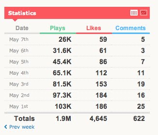
On my desktop is a word document called sites I like. When I see a particularly attractive handling of information, I take a screenshot & slap it into this document.
This little bit of information visualization on Vimeo is the type of thing I snatched up right away. Let me tell you why I love it:
the data is bolded
the data text & background appear in easy-to-read high contrast, the supporting materials (the facets) appear in lower contrasting colors
the table provides a means to see this same information in a chart but defaults to the less apt for misinterpretation data
totals of the data augment what can be seen at first blush
efficient displays of data (1.9M is easier to read & mentally download than 1,900,000)
The pattern here is that the visual focus is on the metrics, the facts, the data only.
I find this in-your-face design trend terrible: below the ads are actually getting in the way of selling newspapers. Oftentimes people are captivated by the front page story. The design below says "Amazingly Low Prices" is the front page story, then something about financial giants, er something.
I'm a proud tightwad, so when someone gets 30 cents out of me, it's a life event.
The other day I was at Barnes & Noble in Dublin and after I ordered my small coffee (so cheap!) the barista did something a bit unexpected. She held up small and medium cups next to each other and said this:
"Do you want the medium? It's only 30 cents more."
Guess what I did? I got it.
If you multiply this simple customer interaction (transaction) for that location then consider the thousands of stores, you're suddenly talking about millions more per year in coffee sales. Wow.
I often wonder: if hard space is more or less unlimited, why are we not constantly snapping photos, video, and recording audio? For example, why don't we:
email our parents who live far away with video of what our garden looks like?
send our friend a picture of an outfit from the dressing room when we need that extra nudge to buy something cute?
use video conferencing rather than calling?
record a song we like so we can look up the lyrics later or ask our music genius friend'what is that crazy instrument?'
In my estimation, there are a few reasons:
We are still stuck in a mindset that space is limited. In other words, you don't "waste" video on something that won't be treasured for years to come.
We balk at filling up terabyte drives with our own drivel because we are already using facebook for that very purpose.
It's hard enough organizing real family photos into albums why create even more content that we'll then have to organize, maintain or otherwise manage?
We haven't yet absorbed the fact that our phones are really powerful computers. We can not yet fully take advantage of what our phones can do for us.
We don't want to seem weird. I mean, everyones already on their phone all the time and sometimes when you take a picture in a store (like me in See's Candy yesterday) you don't want to feel awkward after you are told that photos aren't allowed.
Privacy. We don't want our embarrassing outfit that really wasn't flattering showing up on fail.com.
Think & discuss. If you have any other additions to these "why don't we" examples please comment!
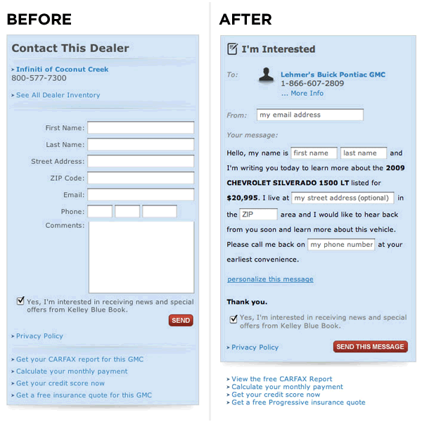
I recently interviewed at a SaaS company only to realize how I need to better organize my work to tell a story of progress.
Many of my examples failed because in most cases, I had the "after" or the "during" images. I was then in a position of talking through the "before" which of course is not as good as simply showing it. It struck me how uncompelling it was to show these things without any context & that's my lesson for the day.
UX, like acne products, is about a highly visible before & after.
LukeW's Before & After shots of a conversion test. The one on the right converts 25%-40% better. Thanks to Mark for the MadLibs blog entry which inspired this post.
It's better to create short dense posts than lengthy infrequent posts.
One of the major culprits of creating great lo-fi information packed posts is a San Francisco entrepreneur RamitSethi, author of I Will Teach You to Be Rich. Here's his designer Ben Bleikamp explaining his rationale in approchingRamit's blog.
Note how Ben talks about:
Trust through "social proof"
How the purchase calls to action complete the "user loop" and how comments don't
I saw this "Easy" button on a camcorder in Best Buy (left) & LOVE it. I have no idea what it does, but don't you just want to press it and see?
One of the smartest technology ad campaigns I've seen isn't even for a purely technical product. I immediately connected with Staple's Easy Button campaign since it got at the heart of what we all want: simplicity. In a world that's become overwrought with distractions & where technology is riddled with meaningless features that do nothing more than cause confusion, it's no wonder this ad caught on. The campaign got nice mainstream media coverage and sold easy buttons for charity. I was lucky enough to press one myself. It was fun.


 and they'll be able to download your ebook/newsletter/template file in exchange for tweeting about your free download. Once you select "Pay with a Tweet" you'll get a window that pre-formats a tweet (something like downloaded xyz from link) then you can "Post Tweet and Download Now". What an innovative marketing mix!


 If you've always wanted to know how