Sunday, February 28, 2010

How UX is like Acne cream


I recently interviewed at a SaaS company only to realize how I need to better organize my work to tell a story of progress.

Many of my examples failed because in most cases, I had the "after" or the "during" images. I was then in a position of talking through the "before" which of course is not as good as simply showing it. It struck me how uncompelling it was to show these things without any context & that's my lesson for the day.

UX, like acne products, is about a highly visible before & after.


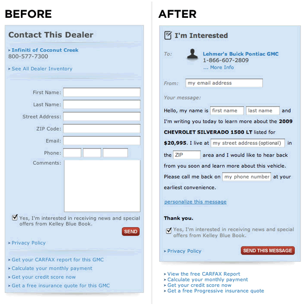
LukeW's Before & After shots of a conversion test. The one on the right converts 25%-40% better. Thanks to Mark for the MadLibs blog entry which inspired this post.

Tuesday, February 23, 2010

Learn by example: The design of iwillteachyoutoberich.com

It's better to create short dense posts than lengthy infrequent posts.

One of the major culprits of creating great lo-fi information packed posts is a San Francisco entrepreneur Ramit Sethi, author of I Will Teach You to Be Rich. Here's his designer Ben Bleikamp explaining his rationale in approching Ramit's blog.

Note how Ben talks about:
  • Trust through "social proof"
  • How the purchase calls to action complete the "user loop" and how comments don't
  • Analytics and live site A/B testing

Friday, February 5, 2010

The Easy Button


I saw this "Easy" button on a camcorder in Best Buy (left) & LOVE it. I have no idea what it does, but don't you just want to press it and see?

One of the smartest technology ad campaigns I've seen isn't even for a purely technical product. I immediately connected with Staple's Easy Button campaign since it got at the heart of what we all want: simplicity. In a world that's become overwrought with distractions & where technology is riddled with meaningless features that do nothing more than cause confusion, it's no wonder this ad caught on. The campaign got nice mainstream media coverage and sold easy buttons for charity. I was lucky enough to press one myself. It was fun.