Monday, August 22, 2011

Infinite Kitty Theorem

At times my cat enjoys the Mac UI. Here she is using the Dashboard App (probably just for the weather. But if you imagine many Kitties and many Macs and all the time in the world, they certainly would have crafted designs like: Google, Twitter, and Facebook.

What you see on the left is a cat-crafted email.

She tabs through the fields. Imagine if she really focused on the user experience.


Laptops are warm and cats can click.


PS: The infinite Kitty Theorem is a reference to this

Wednesday, August 17, 2011

What's the most lame product you've ever seen?

Wha?
How on earth do products like this make it out the door? When you think about how many stages there are in a product life cycle, market research, sketching, prototyping, manufacturing it boggles my mind how this one got past the first stage. Here are just some of the things that make me want to find the person responsible for this and shake him/her:
  • The over $4 price point. The banana packaging makes me think kids might find this desirable, but this is way too expensive to delight a sane parent. 
  • This isn't bubble bath--it's hair product. So this is in the same category as CREW, Bed Head, Dove, and other brands that scream "you respect yourself and we respect you. Let's make you look good." This brand screams "We are very silly and gross! Massage this on your hair."
  • I'm all for Zagging when others Zig however, it needs to be done with your market in mind. Who on earth is this for? Is it human?
  • The monkey theme is cute but monkey brains aren't cute.

What's the most lame product you've ever seen?

Friday, August 5, 2011

Hip Happenings


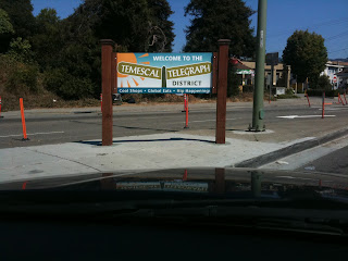
I adore architecture and sculpture. Somehow, I generally don't love it when cities try to sell their neighborhoods with poorly-designed sinage or art. Below find an apt description of the Temescal district: Cool shops, Global Eats, and Hip Happenings. Yes, all of this is true, but somehow saying it . . . like this . . . I guess what I'd rather see is a font & design that works to capture the image of a world-class neighborhood.

Berkeley shines a spotlight on the border it shares with Oakland. This  split "Here" on the Berkeley side and "There" on the Oakland side is called playful by some, irksome by others.  I do like the font and sheer size of the sculpture. Can't say I like the message, though.

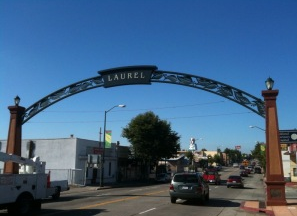
Laurel's archways in Oakland are loud and proud. Providing two archways at the start and end of the Laurel's main street, this is expressive, easy to read, easy on the eyes, and seems to be happy to see you.

Wednesday, August 3, 2011

Extra Packaging

While at Target (maybe my favorite store) I was checking out the kettle bells when I passed these weights. Weights are designed to be held. Yet here are some 3 pound weights with a strap. Hm.

Monday, August 1, 2011

Our site launched!

Last year, after over a decade as a full-time interaction designer, I started working as a contractor. Along the way I started collaborating with a former Mills College classmate, Raye Oldes. We worked well together and we decided we were no longer contractors, we were acting and working more like a small company. Our clients thought it was a good idea too! Neat, huh?

It's with great pleasure that I introduce TUX Studio. What's TUX mean? It stands for our obsession:  The User eXperience. As we wireframe, storyboard, usability test our hearts out, we never forget why we're here: To provide users an excellent experience while making our clients feel pretty awesome too.