

Monday, November 30, 2009
Monday, November 23, 2009
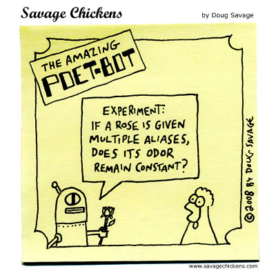
This invention is long overdue

Check out how artist Bruno Taylor modified several bus stops in London. I love this idea :)
Friday, November 20, 2009
Design Heuristics by Wicken, Gordon, & Liu
Thanks to one of my classmates at the University of Illinois, Michael Berner, I still have & use the "13 Principles of Display Design" the seminal textbook An Introduction to Human Factors Engineering from a class of the same name we took together in 1997. The author, also our instructor, Christopher Wickens is an academic visionary in the field of Human Factors. After U of I, Christopher Wickens joined the University of Colorado before joining Alion Micro Analysis & Design, a consulting services and software products company. Please find the book citation at the bottom of this entry. OK, on to the heuristics. My personal favorites are #3, #9, and #10.
Perceptual Principles
1) avoid absolute judgment limits: do not require the operator to judge the level of a represented variable on the basis of a single sensory variable (e.g., color, size, loudness) which contains more than five to seven possible levels (for some dimensions an even smaller number of levels is preferable; e.g., saturation)
2) take into account top-down processing: if a signal is presented that is contrary to expectations, more physical evidence of that signal must be presented to guarantee that it will be processed
3) make use of redundancy gain: same message in alternative physical forms (not simply repetition; e.g., traffic lights: position and hue are redundant); the factors that might degrade one form (e.g., noise degrading auditory message), will not degrade the other (e.g., printed text)
4) ensure discrimination (similarity causes confusion): delete unnecessary similar features and highlight dissimilar ones in order to create distinctiveness (what causes two signals to be similar is the ratio of similar features to dissimilar ones)
Mental Model Principles
5) principle of pictorial realism: a display should look like (i.e., be a picture of) the variable that it represents (e.g., temperature can be high or low, therefore a temperature display should be oriented vertically); if a display contains multiple elements, these can be configured in a manner that looks like how they are configured in the environment that is represented (or the operator's conceptualization of that environment) [principle of configural displays]
6) principle of the moving part: the moving element(s) of any display of dynamic info should move in a spatial pattern and direction that is compatible with the user's mental model of how the represented element moves (e.g., increasing altitude, upwards movements of the moving element on an altimeter; BUT: limited display space in the cockpit)
sometimes these principles are conflicting: for example, display of an aircraft's banking position relative to the horizon; from the pilot's perspective, the horizon is moving; from a pictorial realism perspective, the airplane is moving; SOLUTION: so-called frequency-separated displays, combine aspects of a fixed-pointer moving-scale display and a fixed-scale moving-pointer display)
7) ecological interface design: adherence to the ecology of the displayed world (see above); map of system, allow access at/to different levels of abstraction; support skill-, rule-, and knowledge-based behavior; semantic mapping & direct manipulation
Principles Based on Attention
8) minimizing information access cost: minimize cost in time/effort of "moving" selective attention from one display location to another by keeping frequently accessed information sources close together so that the cost of "traveling" between them is small
9) proximity compatibility principle: when two or more sources of info are related to the same task and must be mentally integrated to complete the task (i.e., they have close "mental proximity") provide them with close "display proximity" by displaying them close together so that their information access costs will be low (in extreme: integrated displays; maybe also: emergent features). However, too much close display proximity is not always good, particularly if one of the elements must be the subject of focused attention
10) principle of multiple resources: sometimes, processing a lot of info can be facilitated by dividing that info across resources (presenting visual and auditory info concurrently, rather than presenting all info in visual format or all information in auditory format) -- important: input modes, response devices, and tasks should be combined such that they are as dissimilar in terms of processing stages, input modalities, and processing codes (e.g., voice dialing [verbal/vocal code/output] a phone number while driving [visual/manual input/code/output] is easier than entering the phone number by key presses)
Memory Principles (consider short-term memory as well as long-term memory limitations)
11) principle of predictive aiding: prediction is a difficult cognitive task (high load on STM) humans are not particularly good at, esp. when our mental resources are consumed with other tasks; proactive behavior is usually more effective than reactive behavior; displays that can explicitly predict what will (or is likely to) happen will generally be quite effective in human performance
12) principle of knowledge in the world (versus knowledge in the head; Don Norman's distinction): placing explicit visible reminders or statements of what is to be done (or how to do something or what something is) at the time and place that will trigger the appropriate action (e.g., pilot's checklist; computer menu listing all available commands); BUT: can lead to clutter; good design must find balance
13) principle of consistency: will lead to positive transfer between different displays (support processing of new displays); e.g., red always means the same thing, consistent organization of display panels.
"An introduction to human factors engineering" by Wickens, C. D., Gordon, S. E., & Liu, Y. (1998). New York, NY: Longman Amazon.com's product page
Thursday, November 19, 2009

Tuesday, November 17, 2009
In Praise of Humility - quotes from Joshua Blankenship's blog
Unsolicited designs, if they’re going to be done at all, should be communicated with class, humility, & a ton of research.
Joshua Blankenship in his blog So Serious in an entry titled Creating Controversy for its own Sake (and How Humility is a Rare Bird Indeed on the Web These Days)
The web will still be full of arrogant, uninformed, polarizing, self-promoting, controversy-creating content that has ramifications no one wants to own up to...still be lacking in common courtesy, humility, and the admittance that most of us don’t know best
Saturday, November 14, 2009
Summaries, executive & not
Summaries are critical to anchoring a reader down when they are faced with complex, detailed, and large volumes of writing. I believe if you call it an Executive Summary you won't just save the reader time, you'll make the audience feel important. Just make sure your summary lives up to it's name.
Friday, November 13, 2009
Quick Thought: What's in a name? Centuries of comprehension
Writing good site/application copy isn't easy. Naming features and companies is even harder.
A rose will still smell like a rose if it is called a rose but if today if we renamed roses to something like, say, snaggles, it would be very, very strange.
Shakespeare assumed we were starting from scratch--we are not. Language has been around too long to be forgettable. Language carries with it centuries of baggage. Opting for clarity above fun, catchy, colorful, or alternative language might seem boring, but muddling a message is rarely good . Since this is UX though, there are always exceptions. Like this Bouys & Gulls bathroom sinage. So cute!

Monday, November 9, 2009
The one UX person you should follow on twitter
 Jane Pyle - UX designer at Genentech. iPhone app design.Branding.Emotional design.Usability
I read a lot of UX blogs & tweets (just save a #ux search if you need some mojo, links, or articles) and Jane consistently delivers the coolest UX tweets. They're fresh, entertaining, & thought-provoking.
Recent Tweet Recap from Jane Pyle
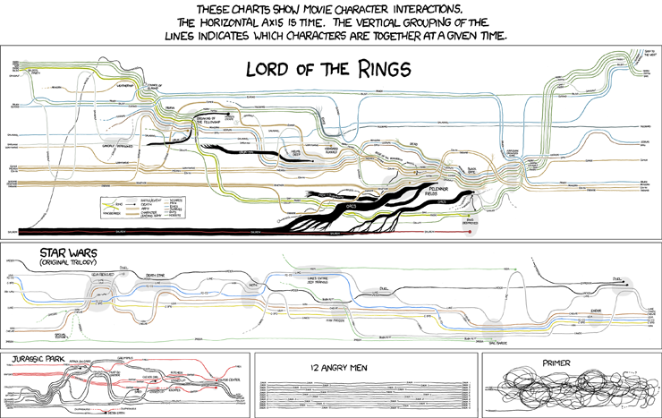
- Movie information visualizations
- A hilarious Electronic System for Travel Authorization form at IQBlog Oh, if only catching criminals were so easy.

- LinkedIn is in the midst of a Redesign!

- Cutting non-data out of a map, literally

- Long overdue: wireframe magnets
Sunday, November 8, 2009
An ode to ET
Tufte shares Orwell's impatience with doublethink and humbuggery, his insight that bad thinking and bad expression travel in a pair, and . . . that they are usually deployed in the service of some brand of propaganda.SCOTT ROSENBERG "The Data Artist" on Salon.com
Lies the parking meter told me
OK, I get it. I can park here for only 30 minutes. Good to know...
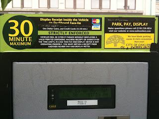
 You're telling me it costs $2 an hour. Ummm.
Don't you mean $1 for 30 minutes since that's the cap? Yeah, you probably do.

 You're telling me it costs $2 an hour. Ummm.
Don't you mean $1 for 30 minutes since that's the cap? Yeah, you probably do.
Saturday, November 7, 2009

Thursday, November 5, 2009
Dear AT&T: you're creeping me out
When I get a text after 10pm on a Monday it better be someone I love very much. My eyebrows furrowed as I received this a month into my service.
>:P

>:P

Saturday, October 31, 2009

Wednesday, October 28, 2009
Companies with a VP of UX
One of Donald Norman's most interesting commands in his interview with Peter Merholz, of Adaptive path, is this: "Start being Vice Presidents".
I chuckled since it's not as if collectively all UX designers are thumbing our noses at the idea.
"Yeah I got another VP job offer. It's so annoying."
"Tell me about it. This executive recruiter followed me to lunch yesterday & paid for it while trying to sell me on his small, highly profitable start-up"
"Crazy"
"Yeah"
Then it struck me: who has a VP UX today?
Google, duh.
I wasn't so sure about Apple. It's harder to tell. Ex-Apple executive, Don Lindsay was tapped for a VP UX position at Research in Motion. In any case, Apple has a laser beam focus on UX through their design process, it certainly sounds like UX is ingrained in the culture. In any case, they both encourage creativity, UX design, testing, and metrics.
So what companies put UX on the same platform as Engineering, Human Resources, Finance, etc?
Vice presidents in User Experience
I tracked down over 500 VP UX's using linkedIn search but the following handful seemed the most significant as many of these companies are thought leaders & highly profitable businesses.
Wells Fargo
 Sarah Bellrichard Vice President, User Experience Research & Design at [LinkedIn]
Google
 Marissa Mayer, Vice President, Search Products & User Experience [Google's bio | LinkedIn ]
TiVo
 Margaret Schmidt, Vice President of User Experience Design and Research [ Harvard Business Publishing article]
Palm
 Matias Duarte Vice President of Human Interface and User Experience [UX Week 2009 interview | LinkedIn]
I chuckled since it's not as if collectively all UX designers are thumbing our noses at the idea.
"Yeah I got another VP job offer. It's so annoying."
"Tell me about it. This executive recruiter followed me to lunch yesterday & paid for it while trying to sell me on his small, highly profitable start-up"
"Crazy"
"Yeah"
Then it struck me: who has a VP UX today?
Google, duh.
I wasn't so sure about Apple. It's harder to tell. Ex-Apple executive, Don Lindsay was tapped for a VP UX position at Research in Motion. In any case, Apple has a laser beam focus on UX through their design process, it certainly sounds like UX is ingrained in the culture. In any case, they both encourage creativity, UX design, testing, and metrics.
So what companies put UX on the same platform as Engineering, Human Resources, Finance, etc?
Vice presidents in User Experience
I tracked down over 500 VP UX's using linkedIn search but the following handful seemed the most significant as many of these companies are thought leaders & highly profitable businesses.
Wells Fargo
 Sarah Bellrichard Vice President, User Experience Research & Design at [LinkedIn]
 Marissa Mayer, Vice President, Search Products & User Experience [Google's bio | LinkedIn ]
TiVo
 Margaret Schmidt, Vice President of User Experience Design and Research [ Harvard Business Publishing article]
Palm
 Matias Duarte Vice President of Human Interface and User Experience [UX Week 2009 interview | LinkedIn]
Sunday, October 18, 2009


Friday, October 9, 2009
If 40 hours a week isn't enough...
 In case you long for the love you get from your taskbar when your away from the machine, MySuiteStuff provides a constant reminder about what you do for a living with these Adobe pillows. It's a great way to announce "Here's what I do for work" to tech savvy visitors. For those less up on the tools of the designer trade, maybe they'll think think of elements on the periodic table in a foreign language.
Seems a more modern interpretation of occupational figurine. Makes a great gift because it won't be in your house. :P

Wednesday, October 7, 2009
UX 101
These sites are regular stops for many UX designers. If they aren't they should be.
A sampling of the kinds of articles a UX designer might read:
Top ten info architecture mistakes Avoid bad “flow”
Article on meganavigation menus They’re big & they work
Information seeking modes Sure, you've thought about how users find something...but how do they find it again? Information seeking models for search.
Tufte’s article on labeling images Direct labeling is better then any kind of mapping
Behavior around system response time good for knowing when to have a spinner & when users will start multitasking
Making design patterns all web companies should have a style guide or page templates at minimum, but whipping one ups isn't exactly easy. Some pitfalls to avoid.
- Smashing Magazine usually visually beautiful & often useful
- Adaptive Path employee blogs, conference videos, conference downloads, podcasts, the list goes on.
- Boxes and Arrows articles & discussions
- User Interface Engineering academic tack
- Use It I've always liked this site's plain Jane approach
- Ask ET articles & discussions lead by Edward Tufte
A sampling of the kinds of articles a UX designer might read:
Top ten info architecture mistakes Avoid bad “flow”
Article on meganavigation menus They’re big & they work
Information seeking modes Sure, you've thought about how users find something...but how do they find it again? Information seeking models for search.
Tufte’s article on labeling images Direct labeling is better then any kind of mapping
Behavior around system response time good for knowing when to have a spinner & when users will start multitasking
Making design patterns all web companies should have a style guide or page templates at minimum, but whipping one ups isn't exactly easy. Some pitfalls to avoid.
Friday, October 2, 2009
my iPhone and me
I have two complaints about the iPhone:
One awesome thing about iPhones is that if you've got a great app idea, can make it happen, & deal with the Apple approval process, it will end up in the iTunes store. My coworker, Mark Allen, created an iPhone App called Loupe which allows you to nab colors you see in the real world & add them to a pallet. iPhone users can now put the crisp colors of the Golden Gate on a beautiful day to create an inspired website, logo, living room, anything with a color scheme.


- I still forget it's more than a phone I'll pull out my computer before correcting myself & choosing the little elegant solution.
- I don't have it with me all the time I recently thought "oooh! I should record this....where's my phone?" and since it was in the other room, I skipped it
One awesome thing about iPhones is that if you've got a great app idea, can make it happen, & deal with the Apple approval process, it will end up in the iTunes store. My coworker, Mark Allen, created an iPhone App called Loupe which allows you to nab colors you see in the real world & add them to a pallet. iPhone users can now put the crisp colors of the Golden Gate on a beautiful day to create an inspired website, logo, living room, anything with a color scheme.
Friday, September 25, 2009
UX Week 2009 in a nutshell
I have to gush some about Adaptive Path. They're professional, smart, and they deeply understand product management, content, & UX Design. I love how their workshops engage & connect professionals. I've learned so much about project management, presenting, engaging customers & coworkers.
My history with Adaptive Path Conferences...
My first AP workshop, was in Seattle I met the guys from Grupthink (a unique & early crowd source web app that unlike yahoo answers, is totally subjective & allows fun participation...Check out a great & not uncommon Grupthink post: What's the best construction achievement in world's architecture and engineering?). They were technical people with an awesome understanding of how to use AJAX for great UX, were fun & from Montana. Aside from meeting great people, I was exposed to excellent uses of AJAX in several web applications, how to do a content inventory & how to prioritize projects (one method anyway).
 My second AP workshop was equally social & educational. I met the writer a great blog called InspireUX which I've mentioned before. Also, I gained a deep understanding how facets, taxonomies, terminology, and language structure can help people find things online (aka Search), even when they aren't sure of the product name. I remember the presenter, Branden Schaur threw rubber ducks at participants, which was fun.
This was my first UX week. The difference between UX week and other adaptive path workshops lies within the structure. UX week divides most days, save for the last day which is all presentations, into both lectures and workshops. Presentations can come from both Adaptive Path employees and industry leaders. One notable aspect of all three experiences was how far participants traveled. I met folks from all over, including: Europe, China, and the East Coast. That speaks volumes about the quality.
Highlight Reel
Here's a summary of only the most memorable portions for me
1. A general theme: Wireframes fail in UX because they don't capture the interactivity and require lots of explaining or hand-waving. As interaction design goes, they often don't cut the mustard & we need to rethink these deliverables.
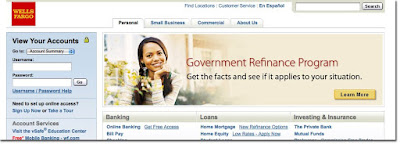
2. A continued frustration: In casual discussions with many UX designers, it seems the field is still frustrated with their respective organizations methods for integrating UX into their process. Save for companies who approach UX as it's own business arm like Google, Apple, and surprisingly Wells Fargo, who have VP UX positions or companies that have UX well-integrated into their process at all levels like Mint.com and most well-run design firms, many folks still feel like the tech industry is lagging, knowing they want a strong UX but not having a deep understanding of what that means to the organizational structure or process. Worse, some companies still haven't gotten past seeing UX more as visual design & layout and the product managers not just owning the features but the interactions & structure that make them work. :(
3. Workshop 1: Sketching - Rachel Glaves
UX professionals should sketch more...it's low cost, allows one to provide several ideas before getting more high fidelity. We talked about sketching UX design patterns and used a variety of markers each designated with a different purpose:
4. Workshop 2: Prototyping - Dan Harrelson
960 degrees offers fun ajax web page templates which allow quick prototyping. This is only for designers willing to get their hands dirty. But the variety of tools like Omnigraffle, Axure, and good old Powerpoint, to name a few (Dan Harrelson provides many more here) makes it a lot easier. We used modified 960 grid system files and in less than an hour, we all had something to show which was interactive
4. Scott McCloud: was great, in part, because I love comic storytellers like Lynda Barry, I really enjoyed Scott McCloud's presentation. He provides tons of quick movement in his slides which is fun to watch. Better than me telling you, you should jsut check out his lecture.

5. Temple Grandin: I've read some of her work and certainly there's a lot to learn from Animal Science professor, Temple Grandin. As an autistic academic, she's got facinating insights into perception and cognition. Again, showing is better than telling in this case so here's University of California Television's video:
Other Attendee's Summaries
Alex Aitken took a stab at summarizing UX Week 2009 in a day-by-day approach
{ Day 1 }
{ Day 2 }
{ Day 3 }
{ Day 4 }
Dave Terry's photostream on Flickr provides a great visual approach

Related...
In Sum...
Conferences are a great break for the grind. I'm looking forward to the IA summit, which will be my first non-Adaptive Path conference. For me, Adaptive Path conferences disseminate very useful techniques and methods and the organization has made a name for itself as a thought leader--creating & sharing best practices for UX design. UX design is a really great field to be in today as more and more organizations & leaders come to understand not just what UX is, but how to engage a UX team so that the product & services that surround it, dazzle, delight, & surprise.
My history with Adaptive Path Conferences...
My first AP workshop, was in Seattle I met the guys from Grupthink (a unique & early crowd source web app that unlike yahoo answers, is totally subjective & allows fun participation...Check out a great & not uncommon Grupthink post: What's the best construction achievement in world's architecture and engineering?). They were technical people with an awesome understanding of how to use AJAX for great UX, were fun & from Montana. Aside from meeting great people, I was exposed to excellent uses of AJAX in several web applications, how to do a content inventory & how to prioritize projects (one method anyway).
My second AP workshop was equally social & educational. I met the writer a great blog called InspireUX which I've mentioned before. Also, I gained a deep understanding how facets, taxonomies, terminology, and language structure can help people find things online (aka Search), even when they aren't sure of the product name. I remember the presenter, Branden Schaur threw rubber ducks at participants, which was fun.This was my first UX week. The difference between UX week and other adaptive path workshops lies within the structure. UX week divides most days, save for the last day which is all presentations, into both lectures and workshops. Presentations can come from both Adaptive Path employees and industry leaders. One notable aspect of all three experiences was how far participants traveled. I met folks from all over, including: Europe, China, and the East Coast. That speaks volumes about the quality.
Highlight Reel
Here's a summary of only the most memorable portions for me
1. A general theme: Wireframes fail in UX because they don't capture the interactivity and require lots of explaining or hand-waving. As interaction design goes, they often don't cut the mustard & we need to rethink these deliverables.
2. A continued frustration: In casual discussions with many UX designers, it seems the field is still frustrated with their respective organizations methods for integrating UX into their process. Save for companies who approach UX as it's own business arm like Google, Apple, and surprisingly Wells Fargo, who have VP UX positions or companies that have UX well-integrated into their process at all levels like Mint.com and most well-run design firms, many folks still feel like the tech industry is lagging, knowing they want a strong UX but not having a deep understanding of what that means to the organizational structure or process. Worse, some companies still haven't gotten past seeing UX more as visual design & layout and the product managers not just owning the features but the interactions & structure that make them work. :(
3. Workshop 1: Sketching - Rachel Glaves
UX professionals should sketch more...it's low cost, allows one to provide several ideas before getting more high fidelity. We talked about sketching UX design patterns and used a variety of markers each designated with a different purpose:
- Thin black - first pass at elements
- Thick black - to call out more important elements
- Grey - De-emphasize background elements
- Yellow - highlight the one or the few things where you'd like to draw the viewer's attention
4. Workshop 2: Prototyping - Dan Harrelson
960 degrees offers fun ajax web page templates which allow quick prototyping. This is only for designers willing to get their hands dirty. But the variety of tools like Omnigraffle, Axure, and good old Powerpoint, to name a few (Dan Harrelson provides many more here) makes it a lot easier. We used modified 960 grid system files and in less than an hour, we all had something to show which was interactive
4. Scott McCloud: was great, in part, because I love comic storytellers like Lynda Barry, I really enjoyed Scott McCloud's presentation. He provides tons of quick movement in his slides which is fun to watch. Better than me telling you, you should jsut check out his lecture.
5. Temple Grandin: I've read some of her work and certainly there's a lot to learn from Animal Science professor, Temple Grandin. As an autistic academic, she's got facinating insights into perception and cognition. Again, showing is better than telling in this case so here's University of California Television's video:
Other Attendee's Summaries
Alex Aitken took a stab at summarizing UX Week 2009 in a day-by-day approach
{ Day 1 }
{ Day 2 }
{ Day 3 }
{ Day 4 }
Dave Terry's photostream on Flickr provides a great visual approach

Related...
In Sum...
Conferences are a great break for the grind. I'm looking forward to the IA summit, which will be my first non-Adaptive Path conference. For me, Adaptive Path conferences disseminate very useful techniques and methods and the organization has made a name for itself as a thought leader--creating & sharing best practices for UX design. UX design is a really great field to be in today as more and more organizations & leaders come to understand not just what UX is, but how to engage a UX team so that the product & services that surround it, dazzle, delight, & surprise.
Thursday, September 24, 2009
A leaf for the fall

I'm hard at work creating a ux week summary....& it's getting close. Just wanted to give you some Fall-colored eye content, thanks to another blog called Watercolor Ways
Thursday, September 17, 2009
I <3 Silverback

Silverback is my favorite tool for user testing screen & video capture.
Can it help you take electronic notes along the way? No.
Can you time tasks within the program? No.
So why do I like it?
It's easy, nimble, and cheap ($50!!! & 10% goes to a great cause). They make it easy by providing a free 30 day trial which is downloadable online.
Using Silverback has been a refreshing alternative to it's counterpart on the Microsoft platform, Techsmith's Morae. I don't want to knock Morae completely...it's got plenty of features. The most useful of which is a remote viewer so that coworkers and collaborators can view the product evaluations as they happen. But with a simple workaround? No contest.
Wednesday, September 16, 2009
User IN-YOUR-FACE design

Shell Gas station one-way communication A-V blast. This is what I call in-your-face design.
Sunday, September 6, 2009
Quick Tips for usability testing
Here are three tips for user testing :
1. Do a dry run
Testing, is not unlike a play. Your role, the equipment, everything, needs to be practiced. You will save yourself time, embarrassment & good user study content when you are fully prepared.
2. Replicate the experience when you can & observe, don't teach
Assuming your test is task-based., give instructions but no guidance. You aren't there to provide a tutorial, you are there to observe. Let users make mistakes & explore. Set a time so that if they get very lost, you allow them to attempt to get back on track before you intervene, & that limit should be at least several seconds. Intervening should be a last resort.
2. Involve the team
Product managers & devlopers should attend user testing or watch the videos. When combed for detail they provide a lot of insight. For some this just isn't possible and they are leaning on you to report your findings. Your job is to translate lots of details into a digestible format they can use.
More tips online:
Usertesting.com: I wish I thought of this first
OK UserTesting.com might not be perfect but it's pretty darned awesome. The rub with this site is that you can very quickly turn around a test with both a video and a written report. The company pays a pool of participants $10 per test & your out-of-pocket expenses are only $30 per 15 minute test.
Value
This is an incredible value considering in-house testing 5 users for 15 minutes will almost certainly cost no less than $300 (assuming a jr. usability professional spends one full day @ $30/hour & users are compensat $10). UserTesting.com cuts that price in half.
Return on Investment
Assuming you've got a team that can rapidly iterate, this is great for a product that's getting tuned or for a product that needs initial investigation. You have to do your own calculations on whether or not this is cost-effective
Doing this testing for each round of iterations would go miles further (and be a lot cheaper) than gathering several coworkers in a room to attempt to accomplish UI design. It's often an uphill battle trying to speak for what users will understand & relate to. But when you have evidence, there can be no dispute. For this reason alone, this has the potential to have a high ROI.
What is it good for?
Usertesting.com has some limits which means it can't yet completely replace in-house testing. Namely, software products it would not make sense for audiences to which you already have immediate access and a low-fi prototype might cause confusion so I'm not sure if that's possible.
Also, I'm not yet sure how long you have access to each video. Anyway, here are the huge plusses:
* Software as a service model means no downloads or storage of huge video files.
* Very quick turnaround--five 15 minute user tests will likely finish within 24 hours.
For live-site testing, this is excellent is an incredibly useful tool to add to the toolbox & look at the buzz they're getting!
Thursday, August 20, 2009
Why spelling matters
warning: this post is a thinly veiled Rail against bad spelling & customer service
I'm a bad speller. Horrible would be the proper word. When spell-check or the nearest English major can't help me out, I just do my best & rely on hope. Luckily, I'm not in charge of storefront signs.
On my way to work every day I pass GreenCitizen. They believe in making the world a better place by recycling electronics. But they don't believe in grammar check.
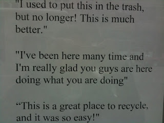 "I've been here many time?" OK I get it, this is from a customer & maybe GCitizen doesn't think refelcts badly on them.
While I can't spell, it doesn't mean I don't appreciate it so I decided to take up the issue with the company.
I started subtley, by putting a stickie on their window with an arrow pointing to the misspelling, which read "(sic.)" to indicate the misspelling was caught. The next day, my stickie was gone.
About a month later. I stopped an employee on his way in & told him how this sign's error bothered me.
"Why do you care if there's a misspelling?"
"Because I pass it every day & it doesn't make you look as good as you are"
He assured me he'd take care of it, but it's still there now, a full month later. :(
Now this issue has crossed into the realm customer service. This is no longer about company image, this is about following through on a commitment.
The panda says no blog lists more examples like above. The panda reference is from the Book Eats, Shoots & Leaves which is a surprisingly delightful read for those of us who are weaker in writing mechanics.
PS: Blogger's spell-check is pretty wonderful
Thursday, August 13, 2009
Mods to a parking meter

Parts of the city of Oakland, now use a kiosk system for parking yet some of the meters remain. This causes confusion, to be sure.
Check out the mods to this meter meant to indicate that the parker should not use the meter:
- Removed meter stick
- Gutted coin slot

It would be much nicer to see a sticker pointing the parker to the kiosk since this design mod seems to say: "Don't pay" when the desired message is really: "Don't pay here. Pay over there!".
Wednesday, August 5, 2009
Old School UI
Saw this bit of Old School UI in a dressing room the other day and all I could think was "wow...you care!" What a great way to allow customers to keep & stay in contact with the dressing room attendant and in art deco style no less.
So with that introduction I present . . . a Button to press.

Monday, August 3, 2009
A random meeting with IXDA SF
Walking home from work last month, I wanted do something different, you know? My default activity is browsing stores. I don't mind heading into a store & looking at stuff for the mental stimuli.
On my way home from work I took an alternate route to do just that.
I encourage you to branch out & get involved in something. Political organizations, a book club, volunteer work, alumni groups, or if you're a UX designer in the Bay area, there's always IXDA-SF.
On my way home from work I took an alternate route to do just that.
I did a double take as I was passing a place called House of Shields. A sign in the window read "Interaction Design Association social upstairs". I stopped in, put on a name tag & started chatting with folks. Name tags were color coded in three styles; One to indicate 'looking for work', one to indicate 'hiring', & a third to indicate 'just mingling'.
I didn't stay long but I left feeling refreshed. There's a lot of smart & funny people in this field & it was fun meeting some of them.
I encourage you to branch out & get involved in something. Political organizations, a book club, volunteer work, alumni groups, or if you're a UX designer in the Bay area, there's always IXDA-SF.
Sunday, July 26, 2009
User Experience: my own definition
My definition of the role of user experience design is something like this:
I say nothing about the tools, deliverables, or methods but I hope I provide a new spin on something I've, in the past, struggled to describe.
What UX designers do: Products should create a smooth experience for customers. Not a bumpy road, not a mine field. An awesome user experience designer considers all touch points to optimize product engagement and delight--something I call "flow".
Scope: Proper UX involves visibility across departments and ties into the development process, back-end architecture, customer service, & advertising experience. This is the one person in your company who keeps her/his eyes focused squarely on the enduser.
In other words, pretty images & icons are nice. But being able to checkout quickly is totally awesome. Get it?
Success Measures: Once users exit the flow, user experience designers want users to remain enthusiastic, recommending, & sharing the spoils of the product, with others.
I say nothing about the tools, deliverables, or methods but I hope I provide a new spin on something I've, in the past, struggled to describe.
Tuesday, July 21, 2009
Story of two Red Carpets
Which red carpet would you rather step out on?
Esteemed US visitor Red Carpet
 Above you'll see a 2006 state department photo of the Japanese Prime Minister arriving near DC. This is Wikipedia's demonstrative photo for "red carpet". As you can see there's a sense of class and royal treatment.
The Avis Red Carpet
I didn't find any Avis messaging that might explain what they mean when they say red carpet-- neither through a web search nor through their web site.

In the dystopian novel 1984, the aim of Newspeak ultimately is to destroy meaning. Nothing means anything when you see signs like "freedom is slavery". The destruction of language is being used in packaging, marketing, and politics. At Avis a few weeks ago, several of us in line certainly didn't feel we got the red carpet experience waiting in 90 degree weather. This is only a bit of the line (pictured above) faced with a sign: "AVIS Key Pickup AVIS Red Carpet"
What does red carpet mean when a company or person uses that language to describe something that's the opposite of the word's dictionary definition.
But there's a bright side: We live in a country where we can retort without fear via sites like Yelp Glass Door & the Politico Truth-o-Meter
Monday, June 29, 2009
Photoshop in real life
 This gets me nostalgic about when I first learned Photoshop in the computer labs at the U of Illinois.
Thursday, June 25, 2009
Unintentional design
 Intended use: Use face down & push prongs securely into a drain to prevent hair and other debris from entering and clogging the drain.
Unintended use: Leave prong side up to poke holes into the bottom of a foot
Mods to a parking machine

Modification to parking payment system at Moscone Center in San Francisco
- One orange piece of paper labeled: "INSERT"
- One orange piece of paper labeled: "Please insert ticket STRIPE to the left"
- One example ticket with the strip facing left
- Contactless rard reader attached
Thursday, June 11, 2009
The story of two Government Agency websites
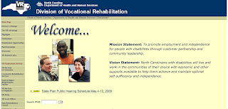
Which state would you rather live in if you need vocational rehabilitation?
California or North Carolina?
California
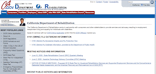
How's the content? Irrelevant news, a discouraging application preamble, and no description of what the site is about.
Telling quote:
How's the content? An encouraging mission & vision statement, help applying, a phone number(!) and address.
Telling quote:
California or North Carolina?
California
How's the content? Irrelevant news, a discouraging application preamble, and no description of what the site is about.
Telling quote:
"DOR's vocational rehabilitation services program assists Californians with disabilities obtain and retain employment and maximize their ability to live independently in their communities."North Carolina
How's the content? An encouraging mission & vision statement, help applying, a phone number(!) and address.
Telling quote:
"When you become a VR consumer, your rehabilitation plan will focus on your abilities and new possibilities. The goal is gainful employment!"Thanks to Anastasia for this blog post idea :)
Monday, May 25, 2009


Sunday, May 3, 2009
A mentor is not enough: a quick guide to finding guidance
Some people, especially those of us that are ahem, a little more early on in their careers, tend to whine about something kind of ridiculous: "I don't have a mentor!" or even more infuriating "No one ever helped me". Ugh.
I hardly know where to begin on this one...but here are some points on this:
1. Don't complain--take action
Keep in contact with people you enjoyed working with, who were engaged, smart, and produced great work. This should be a variety of people both at, above, and below your own level of experience. There is no career silver bullet that is going to make everything align perfectly. A mentor who's just like you only further along in his/her career is hard, but it's impossible if you never branch out, reach out, or go out. Don't let shame or guilt get in the way. If you ping people regularly just to say hi, when you finally do need a favor, they'll hook you up and you won't feel bad/weird about contacting them out of the blue because you need help.
2. Be ignored & be OK
Expect a variety of responses...such as unexpected great advice or total flakes. I'll give you some examples, both good and bad:
3. Read a book
Thirsty for help? People who write books are there for you, waiting patiently at your library & favorite bookstore.
4. Mental Alchemy
Sometimes you just won't have the advice you need from a direct source. In absence of real advice, consider your old favorite bosses. List of some of the things they did great & why you liked them. Do they all have something in common. Stitch together a set of themes you notice across great leadership. Those are the traits things you should develop.
5. Meet new people
Go to conferences, professional meetings and bring business cards. You might not meet the right person, but due to the law of six degrees, you'll meet someone who knows the right person.
6. Work with what you've got
Appreciate the talents within the people immediately around you. They don't need to have even climbed the corporate ladder, they might just be awesome at something. You definitely know people who are awesome at something. Gardening, Running, etc. Learn their habits and you'll have no shortage of quality role models.
I hardly know where to begin on this one...but here are some points on this:
1. Don't complain--take action
Keep in contact with people you enjoyed working with, who were engaged, smart, and produced great work. This should be a variety of people both at, above, and below your own level of experience. There is no career silver bullet that is going to make everything align perfectly. A mentor who's just like you only further along in his/her career is hard, but it's impossible if you never branch out, reach out, or go out. Don't let shame or guilt get in the way. If you ping people regularly just to say hi, when you finally do need a favor, they'll hook you up and you won't feel bad/weird about contacting them out of the blue because you need help.
2. Be ignored & be OK
Expect a variety of responses...such as unexpected great advice or total flakes. I'll give you some examples, both good and bad:
- I'm still in touch with one of my first bosses who lives in Illinois. I'll drop him a postcard or letter from time to time & ALWAYS get a response. As a former U of Illinois Omnibudsman & director he has tons of perspective on life, managing, and is still funny. I've never tapped him for a favor, but I have no doubt he would help out.
- At one job, the VP of my department agreed to meet with me once a month to mentor me. Sounds like a great opportunity right? He had very little in the way of advice and even less personality. I once pressed him explicitly for some kind of tip since he wasn't engaged at all. His advice? Something about money. Nothing about relationships. Hmph.
- One former coworker and friend dropped off the face of the planet after she left the company. Though I'd emailed her a few times, I never heard from her again.
- A friend of a friend talked with me for over an hour on the phone, offering tips, & advice on negotiating, running a business, & at the end even offered some work (I wasn't available but this was still wonderful & a lot).
3. Read a book
Thirsty for help? People who write books are there for you, waiting patiently at your library & favorite bookstore.
4. Mental Alchemy
Sometimes you just won't have the advice you need from a direct source. In absence of real advice, consider your old favorite bosses. List of some of the things they did great & why you liked them. Do they all have something in common. Stitch together a set of themes you notice across great leadership. Those are the traits things you should develop.
5. Meet new people
Go to conferences, professional meetings and bring business cards. You might not meet the right person, but due to the law of six degrees, you'll meet someone who knows the right person.
6. Work with what you've got
Appreciate the talents within the people immediately around you. They don't need to have even climbed the corporate ladder, they might just be awesome at something. You definitely know people who are awesome at something. Gardening, Running, etc. Learn their habits and you'll have no shortage of quality role models.
Wednesday, April 29, 2009
Illegal, dangerous design: Not just a problem of Big Brother
Do you get an icky feeling when you see a red light camera? Holman Jenkins Jr.'s article on Shortening Yellow lights sheds light on how,
Design that violates it's audiences safety is wrong on so many levels. Don't design something that is profitable, dangerous, and hated. If you are encouraged to do so, you probably work for a scummy company. It's not good for your conscious.
Shudder.
"red-light cameras (which are designed to be conspicuous to motorists) lead to an increase in rear-end collisions"and that:
"...the solution is usually a longer yellow -- at least three seconds is the recommended minimum for a 25-mph intersection....Half a dozen Georgia towns just cancelled (sic.) their camera contracts after a state law mandating the addition of an extra second to the yellow made them unprofitable."Pretty gross, no? The Federal government & many states provide laws specifying yellow light duration. Some cities have prioritized their own revenue over safety, the law & common sense and people are fighting back.
Design that violates it's audiences safety is wrong on so many levels. Don't design something that is profitable, dangerous, and hated. If you are encouraged to do so, you probably work for a scummy company. It's not good for your conscious.
Shudder.
Sunday, April 19, 2009
Ode to Undo
Before you I may have made a mistake or two
dashed off a letter I didn't mean to
because people make mistakes....
a few
of them do
& there you sit through & through
you
little button labeled "undo"
You also come in the form
of easy returns
for it seems as a system
you've come to learn
I act at times without concern
For my dollar sometimes flies
and doesn't discern
between a right
and a wrong
dollarly turn
So you care
and you hault
like zipcar
like yelp
you help
and you help
delete is so permanent
publish so firm
the recorded message,
a terrible burn
I thank you for the key strokes
I don't need to do
& there you sit through & through
you
little button labeled "undo"
Friday, April 17, 2009
UI, UX, Interaction, etc.
Most of the time, when I tell people I'm a UI designer they ask "what's that?" Often, what follows is some bang-up job, but I really like Wikipedia's take on User Interface Design.
Oh, don't forget Interaction Design, Information Design, Information Architecture, User Experience Design, Human Factors, Human-Computer interaction & Information Visualization. OK, I know these all have subtle differences but still. Can we stop the madness?
Unlike computer science which tends to overload terms, to assign many different meanings to one word, User experience suffers from term dispersement. Too many terms for the same or very similar things.


Template: An out-of-the-blue email to a potential role-model
Two things you should be good at for the sake of your career is keeping in touch & writing well. Here's a template for getting in touch with someone who you admired at your old job:
Hi, idolname:
I hope you are well. I worked on projectName as a pastJobTitle while you were hired on at lastCompany. I'm now a currentJobtitle at companyName which is a great company & I love it there.
I'm working to define goals in my own career & I feel I could learn a lot in hearing more about yours. I would love to buy you lunch at eateryNearIdolsWork and talk about it sometime next week.
Let me know,
you
Tuesday, February 24, 2009
Get inside the hiring managers head
I know I've talked a lot about job hunting...blame the economy.
Recently, I posted a job ad for a part-time job helping me out on some personal projects. In it, I asked applicants, as a bonus to list three websites they like and one or two sentences on why. This proved to be a great idea. I was easily able to sort out "nos" and "maybes" by who did the bonus and who did not. When people just replied with a form letter & resume they were a "no". It seemed like this was one of a dozen or so of jobs to which they were half-heatedly applying in that session.
Some applicants took it a step further and mentioned why they were looking for work. I think this is obvious but I'll say it anyway, If you are looking because you need to make ends meet, or are having a hard time finding work because you lack experience, the cover letter is not the place to mention this. In fact, this isn't something to say to anyone hiring or anyone you work for. This is something to say to your friends.
The websites applicants provided gave me a glimpse of their personalities, writing skills, & organization.
Out of about 40 applicants, two applicants went a step further and provided a list of what skills they brought to the table in relation to the job requirements. Excellent.
For more tips I highly recommend this best of Craigslist article: Tips for applying to a job from Craigslist. You'll find spending a little more time customizing and polishing cover letters is worth it.
Wednesday, February 11, 2009
Sites to help with your job hunt
With this list, I tried to skip the obvious sites. First some tips:
Indeed
An aggregate site (picture kayak for job searching)
Boxes & Arrows
Not many jobs but they are all related to UI
LinkedIn
Facebook for job seekers: this is also a great resource to share & otherwise manage your resume.
BayChi JobBank - Bay Area
Requires you to join BayChi, which is modestly priced at about $25 a year
Triangle User Experience - Research Triangle near Raleigh, NC
This blog always features UX jobs on one of my favorite parts of the East Coast.
- Put these sites & any other sites related to your search in an easy-to-access bookmark folder...firefox is great because there is an option to "Open All in Tabs" when you create a folder & put it on your toolbar.
- Don't rely exclusively on websites. Don't be shy about inviting people to lunch. And if you can afford it, treat. Brainstorm with friends, get in touch with old coworkers, bosses, and old professors/advisers for council.
Indeed
An aggregate site (picture kayak for job searching)
Boxes & Arrows
Not many jobs but they are all related to UI
Facebook for job seekers: this is also a great resource to share & otherwise manage your resume.
BayChi JobBank - Bay Area
Requires you to join BayChi, which is modestly priced at about $25 a year
Triangle User Experience - Research Triangle near Raleigh, NC
This blog always features UX jobs on one of my favorite parts of the East Coast.
Sunday, January 25, 2009
Women in computer science
Read the wikipedia article on women in computer science.
The primary point of the article is how there aren't any women in computer science. There's even a suggestion to merge this article with "Declination of Women in Computer Science".
Rea lly?
lly?
What about the women who are computer scientists? There are plenty women who do & did great research. The focus of an article titled "Women in Computing" should focus on women in computing. The picture to the right is Anita Borg
I've never enjoyed this desperation on the part of computer science to attract women. It's like a guy with no confidence and can't get a date. I have the same advice to computer science or any field that is looking to balance itself out: work on yourself!
I'm going to rewrite this Wikipedia article once I do some research of my own.
The primary point of the article is how there aren't any women in computer science. There's even a suggestion to merge this article with "Declination of Women in Computer Science".
Rea
 lly?
lly?What about the women who are computer scientists? There are plenty women who do & did great research. The focus of an article titled "Women in Computing" should focus on women in computing. The picture to the right is Anita Borg
I've never enjoyed this desperation on the part of computer science to attract women. It's like a guy with no confidence and can't get a date. I have the same advice to computer science or any field that is looking to balance itself out: work on yourself!
I'm going to rewrite this Wikipedia article once I do some research of my own.
Subscribe to:
Posts (Atom)