Thursday, May 20, 2010

Selling out Wayne's World style

Wane's World did one of the best parodies of something happening all of the time on reality TV: cross-marketing.

Some of my favorite shows involve segments where they pitch products with this same deadpan approach and minus the humor. But I have to think the TV contestants are subconsciously remembering this scene to justify hocking wares they don't even like.


Benjamin: Wayne! Listen, we need to have a talk about Vanderhoff. The fact is he's the sponsor and you signed a contract guaranteeing him certain concessions, one of them being a spot on the show.
Wayne Campbell: [holding a Pizza Hut box] Well that's where I see things just a little differently. Contract or no, I will not bow to any sponsor.
Benjamin: I'm sorry you feel that way, but basically it's the nature of the beast.
Wayne Campbell: [holding a bag of Doritos] Maybe I'm wrong on this one, but for me, the beast doesn't include selling out. Garth, you know what I'm talking about, right?
Garth Algar: [wearing Reebok wardrobe] It's like people only do these things because they can get paid. And that's just really sad.
Wayne Campbell: I can't talk about it anymore; it's giving me a headache.
Garth Algar: Here, take two of these!
[Dumps two Nuprin pills into Wayne's hand]
Wayne Campbell: Ah, Nuprin. Little. Yellow. Different.
Benjamin: Look, you can stay here in the big leagues and play by the rules, or you can go back to the farm club in Aurora. It's your choice.
Wayne Campbell: [holding a can of Pepsi] Yes, and it's the choice of a new generation.

Friday, May 7, 2010

Facts on display: Vimeo's nice little table

On my desktop is a word document called sites I like. When I see a particularly attractive handling of information, I take a screenshot & slap it into this document.

This little bit of information visualization on Vimeo is the type of thing I snatched up right away. Let me tell you why I love it:
  • the data is bolded
  • the data text & background appear in easy-to-read high contrast, the supporting materials (the facets) appear in lower contrasting colors
  • the table provides a means to see this same information in a chart but defaults to the less apt for misinterpretation data
  • totals of the data augment what can be seen at first blush
  • efficient displays of data (1.9M is easier to read & mentally download than 1,900,000)
The pattern here is that the visual focus is on the metrics, the facts, the data only.


Thursday, May 6, 2010

Selling Newspapers

I find this in-your-face design trend terrible: below the ads are actually getting in the way of selling newspapers. Oftentimes people are captivated by the front page story. The design below says "Amazingly Low Prices" is the front page story, then something about financial giants, er something.

Wednesday, May 5, 2010

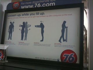
House ad that manages not to cause snoring

While filling up I've seen icky, icky things. But this ad was refreshing, light, and most importantly, not annoying.