
 On my desktop is a word document called sites I like. When I see a particularly attractive handling of information, I take a screenshot & slap it into this document.
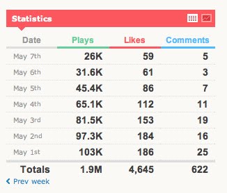
This little bit of information visualization on Vimeo is the type of thing I snatched up right away. Let me tell you why I love it:
- the data is bolded
- the data text & background appear in easy-to-read high contrast, the supporting materials (the facets) appear in lower contrasting colors
- the table provides a means to see this same information in a chart but defaults to the less apt for misinterpretation data
- totals of the data augment what can be seen at first blush
- efficient displays of data (1.9M is easier to read & mentally download than 1,900,000)
The pattern here is that the visual focus is on the metrics, the facts, the data only.
No comments:
Post a Comment