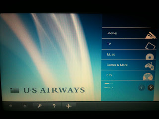
International flights don't excite me. Oftentimes, I do not sleep, so to make the time pass I watch movie after movie, arriving at my destination bleary-eyed and full of anticipation that upon seeing my red suitcase on the baggage claim will result in a dramatic swelling of music.
What delights me about these flights, though, is checking out their user interface. It's a chance to study how an airline does a multimedia player.
 |
| The home screen |
 |
| The Category page for TV |
 |
| After you choose a category you can play or view a preview |
 |
| Checkers love this page, since it has estimated time of arrival! They offer another page (which somehow I didn't capture) with a map with your departure and arrival countries and a large plane graphic in the current position. |
Overall, could the User experience be better? Oh, yes, but it's pretty darned good.

No comments:
Post a Comment